Fonts are the most significant thing to consider in Web / UI design. Good use of fonts make your design significantly better so it will communicate better with the user, this...
 Download Source
 Download Source
 Download Source
 Download Source
 Download Source
 Download Source
 Download Source
 Download Source
 Download Source
Fonts are the most significant thing to consider in Web / UI design. Good use of fonts make your design significantly better so it will communicate better with the user, this process need a good typeface. You can easily get lots of free fonts from internet but you have to make sure that u choose the best free font that go well with the design. Most of the good type faces are expensive. If you are looking for decrease your design cost, you really need to find good fonts which we can download for free. This is the point which makes this post important, we will regularly search for free fonts and we will showcase the very best free fonts for you in a weekly basis. If you know any good free fonts or if we miss anything please let us know.
Imperial Free Font
This font is based on the corporate font for the game The Mandate. The Mandate is a science fiction role playing game which sees the player as a disgraced space captain who gets one chance at redemption and is the last desperate hope for the newly crowned Empress to restore peace and secure the future of humanity.

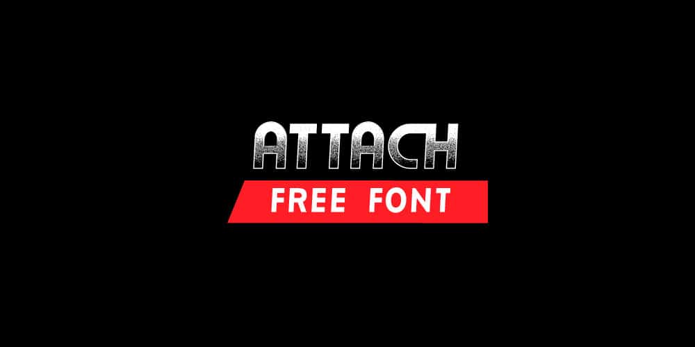
Attach Bold Free Font
Attach Bold is a free font .It was designed as a display type for titles, headlines, and posters.

Anson Free Font

Sifonn Font
Sifonn is a display typeface consisting in 3 weights, a Pro version with more than 900 glyphs, with a large set of ligatures, titling alternates, fractions, catch words and multiple opentype features. It also comes with a Basic and Basic Outline version with the standard char set (360 glyphs), both available for free download.

AC Brodie Free Font
AC Brodie is a font made for titles or headlines with a 1940′s futuristic look.The design is based on a geometrical pattern, namely a rectangle, where the lower case is two thirds of the upper case, with the ascenders the same height as the caps.

Esqadero FF CY 4F Free Font

Rose Free Font

Dyspepsia Free Font

Science Fair Font


No comments:
Post a Comment